2026 Digital Marketing
F&B Digital Marketing for 2026
Digital Marketing 2026: Learn how Generative Engine Optimization (GEO), Zero-Click Search, and authentic content will define your future growth.
Is your menu design losing you money? Discover 6 psychological nudges from Decoy Pricing to the Golden Triangle that guide guests to your best dishes.
Most restaurant owners believe their menu is a list of food. They are wrong.
A menu is not a list. It is a sales map.
When a guest sits down at your table, they are entering a high-pressure psychological environment. They are hungry, they are price-sensitive, and they are suffering from "decision fatigue." In this vulnerable state, the design of your menu dictates exactly what they will buy.
If you list your items by price (Low to High), you are training them to buy the cheapest dish. If you list 20 options in one category, you are forcing them into "analysis paralysis."
As a Digital Marketing Strategist focused on Consumer Psychology, I apply "Nudge Theory"—a behavioral science concept popularized by Nobel laureate Richard Thaler—to restaurant menus. A "nudge" is a subtle design choice that alters behavior in a predictable way without forbidding any options.
In this deep dive, I will show you how to redesign your menu (both physical and digital) to "nudge" guests toward your highest-margin dishes, increasing your average check size by 15-20% without changing a single ingredient.
Where does the eye go first? You might think guests read a menu like a book, from top-left to bottom-right. Eye-tracking studies suggest otherwise.
The Classical Scan Path For physical menus, the eyes typically follow the "Golden Triangle":
The Middle: The eye lands here first.
Top Right: The eye travels here second (where you should put your high-margin entrées).
Top Left: The eye finishes here (usually where appetizers or healthy options sit).
The Digital Shift (The F-Pattern) However, in 2026, many of your guests are ordering from a smartphone (QR Code menus). On a screen, the "Golden Triangle" dies. Users scan in an "F-Pattern": they read the top headline, scan down the left side, and ignore the bottom right.
The Strategy:
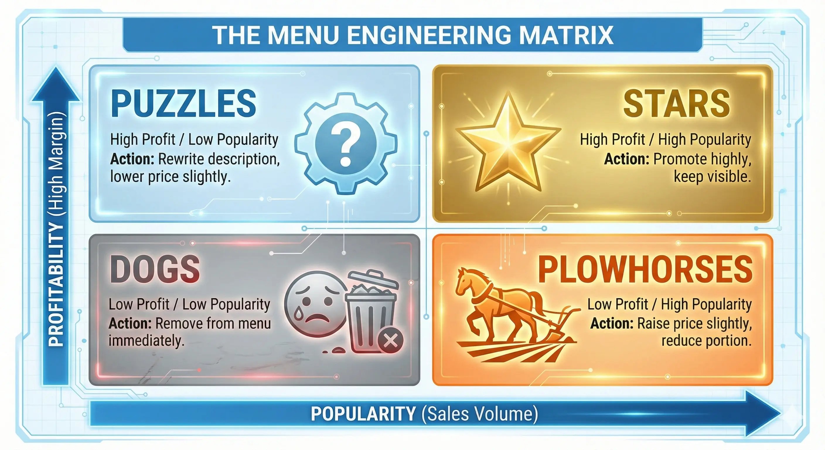
Physical Menu: Place your "Cash Cow" (High Popularity, High Profit) in the Top Right corner.
Digital Menu: Place your "Cash Cow" as the first item in the category. Do not force users to scroll to find your best dish.
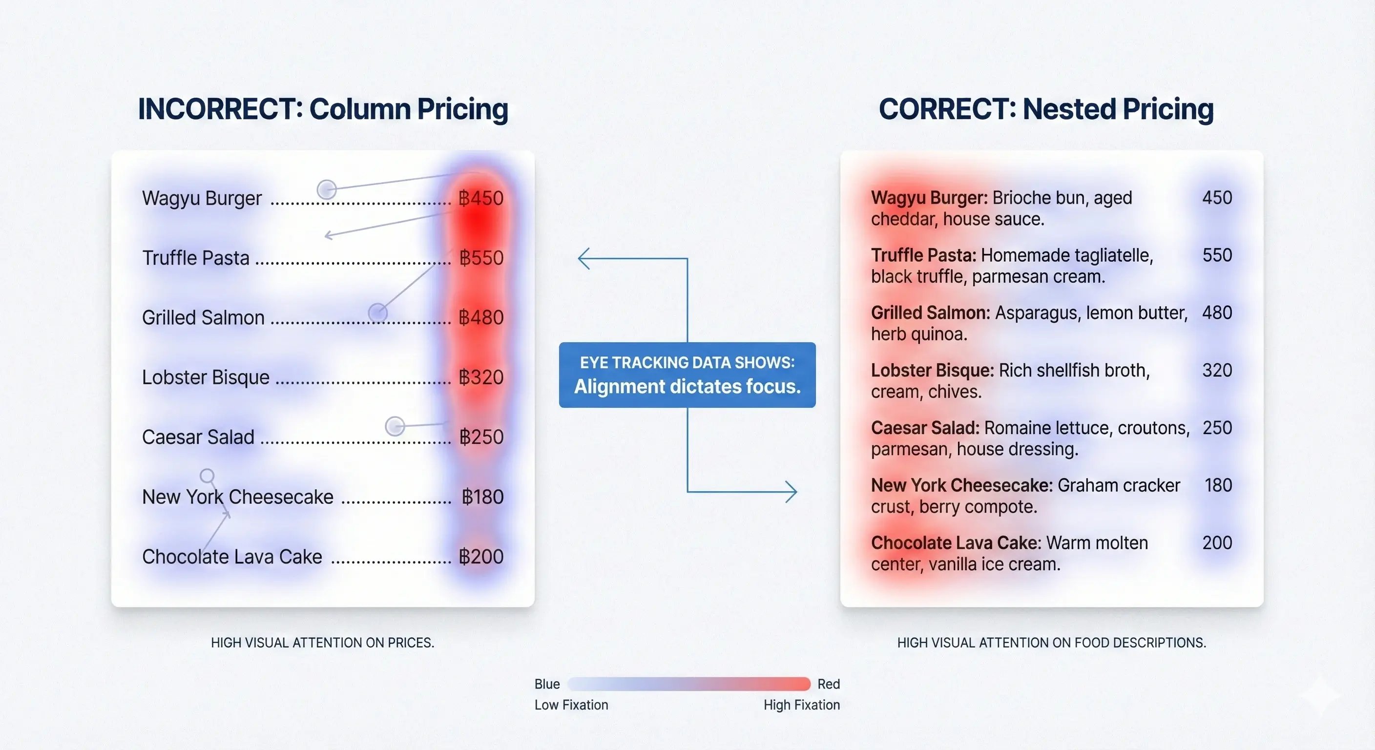
Buying things hurts. Psychologists call this the "Pain of Paying." When a human sees a currency symbol (฿, $, £), it triggers the pain centers in the brain associated with loss.
Remove the Symbol A landmark study by Cornell University found that guests spent significantly less when menus used currency signs ($12.00). When the prices were listed as simple numerals (12.00 or just 12), guests spent 8% more.
Align, Don't List Never use a column of prices down the right side of the page.
Bad Design:
Burger .......................... $15
Pasta ............................. $18
Steak ............................. $25
Result: The eye scans the price column first and picks the cheapest number.
Good Design:
The Burger (15): A classic beef patty...
Result: The price is "tucked" into the description. The guest reads the food first, then sees the price.
How do you sell a 1,200 THB Wagyu Steak? You put a 3,000 THB Tomahawk next to it.
This is called "Anchoring." Humans are terrible at judging absolute value. We only understand relative value. If the most expensive thing on your menu is 1,200 THB, it feels "expensive." But if you add a "Decoy" item that is 3,000 THB, suddenly the 1,200 THB steak feels "reasonable" and "good value."
The Strategy: You don't actually expect to sell the 3,000 THB Tomahawk (though if you do, great!). Its only job is to sit there and make the 1,200 THB steak look affordable by comparison.
Price is a feeling, not a fact. The first item they see sets the standard. If you confuse them, you lose them.
"Grilled Chicken." That is a label, not a description. It tells me what it is, but it doesn't tell me how it tastes.
The "Adjective" Boost Research shows that using descriptive, sensory labels can increase sales by 27%. Compare these two descriptions:
Standard: "Seafood Pasta with Tomato Sauce."
Sensory: "Succulent Andaman Prawns tossed in a Slow-Roasted Tuscan Tomato Glaze."
Why It Works Descriptive labels do two things:
Taste Expectation: The guest imagines the flavor before ordering (mental simulation).
Value Justification: It explains why the price is higher. "Slow-roasted" implies time and labor, which justifies the cost.
It seems logical that offering more options would make customers happier. The opposite is true. This is the "Paradox of Choice."
The Jam Study In a famous study, a grocery store set up a display with 24 jams, and another with only 6 jams.
The 24-jam display got more attention, but only 3% of people bought.
The 6-jam display got less attention, but 30% of people bought.
The Rule of 7 In menu engineering, the magic number is 7. Never list more than 7 items in a single category (Appetizers, Mains, Desserts). If you have 15 appetizers, break them into two sub-categories (e.g., "Hot Starters" and "Cold Raw Bar"). This reduces cognitive load and helps the guest choose faster.
You can control exactly where the guest looks using "Visual Magnets."
The Power of the Box Placing a box or a border around a specific menu item draws the eye immediately. Use this for your "Stars" (High Profit, High Popularity). But be careful: if you box everything, you box nothing. Limit this to one item per page.
The Photo Dilemma Should you use photos?
High-End Dining: No. It looks cheap. Use descriptive copy instead.
Casual Dining/Delivery: Yes. One professional photo can increase sales of that item by 30%. But again, limit it. If every dish has a photo, your menu looks like a flyer.
Digital Menu Nudges (For QR/Delivery Apps):
Default Sizing: Pre-select "Large" as the default option (users often stick with the default).
The "Add-On" Pop-Up: "Would you like fries with that?" works. It’s an automatic upsell that requires zero staff training.
Social Proof Tags: Adding a "Most Popular" or "Trending Now" tag leverages FOMO (Fear Of Missing Out).
"A menu is the only piece of advertising you can be 100% sure your customer will read. If you aren't optimizing it using data, you are essentially throwing away free revenue every single night." — Ni Htoo Kyaw, F&B Digital Marketing Strategist
Many chefs design menus based on their ego. "I want to cook this, so I will list it." A Growth Analyst designs menus based on data.
By applying these psychological principles, you are elevating your F&B Digital Marketing strategy from simple promotion to scientific revenue generation.
But remember: A great menu only works if people can actually find your restaurant. Once you have engineered the perfect menu, you need to make sure the world knows you exist.
[Read Next: Beyond "Near Me": How to Dominate Google Maps & Local SEO in Bangkok]
Digital Marketing 2026: Learn how Generative Engine Optimization (GEO), Zero-Click Search, and authentic content will define your future growth.
Invisible on Google Maps? You're losing revenue. Master the art of Bangkok Local SEO, Google Business Profile optimization, and Local Citations to...
AI is changing F&B Digital Marketing. Learn to optimize for Google SGE, win Zero-Click searches, and use Schema markup so robots recommend your...